Canvas display
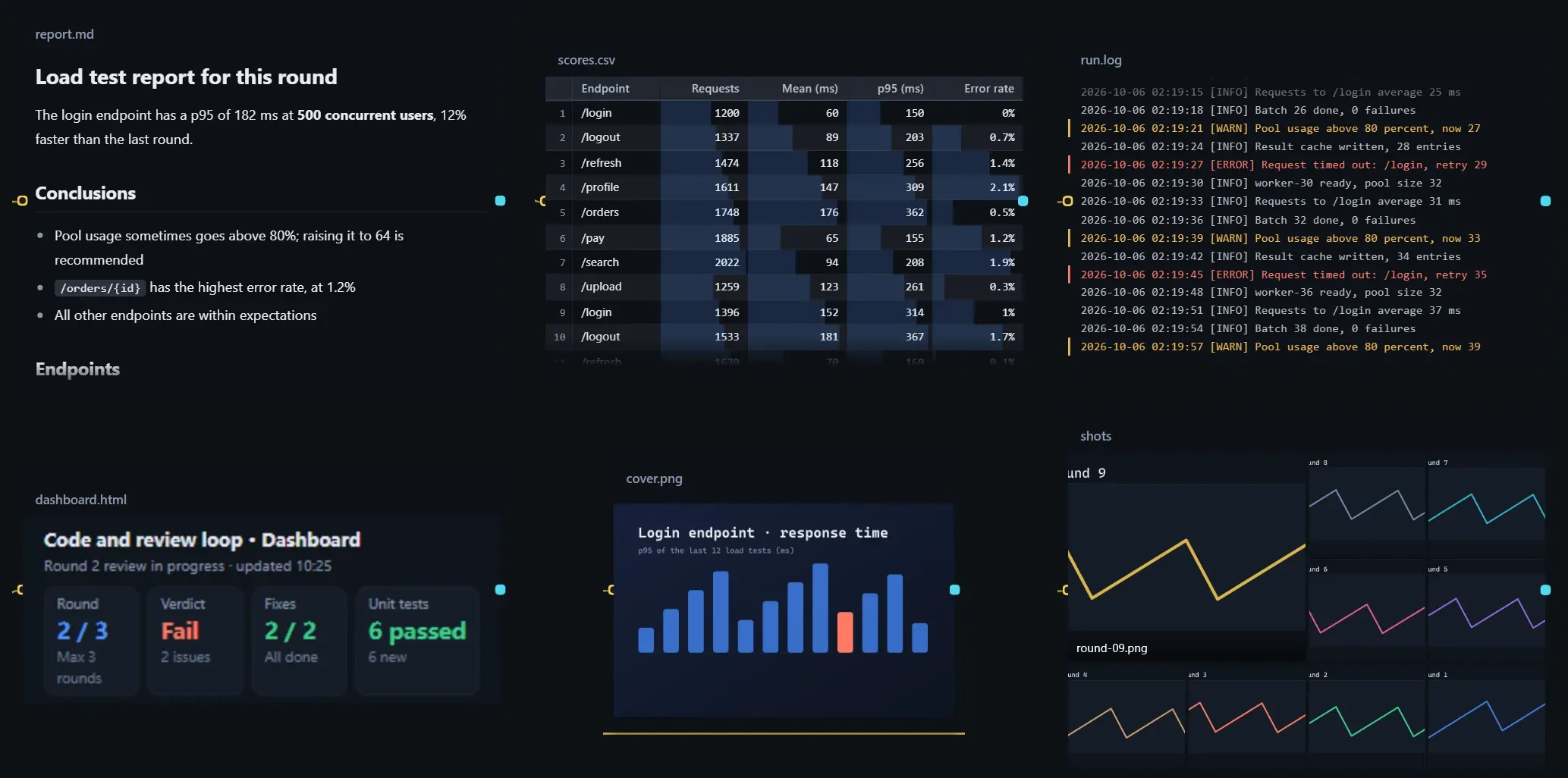
Turn a resource card into a display area on the canvas: images, web pages, Markdown, logs, tables and folders show up directly, with no need to open the file.
With Show on the canvas turned on, a resource card becomes a display area: files written by steps appear on the canvas after a run and switch to the latest content whenever they change. Dashboards, reports, screenshots and logs no longer have to be opened one by one.
Supported content
Section titled “Supported content”| Content | Page |
|---|---|
| Images | Images |
| HTML pages, dashboards | Web pages and dashboards |
| Markdown | Markdown |
| Logs, plain text | Logs and plain text |
| CSV, TSV | Tables |
| JSON, code, config | JSON, code and config |
| Folders | Folders and image walls |
URLs and skills cannot be displayed. In a loop, the output of every round can be looked back at and compared; see Reviewing each round’s output.
Turn it on
Section titled “Turn it on”- Select a resource card and turn on Show on the canvas in the right panel. If the resource has several items, use Content to choose which one to show.
- Drag the bottom-right corner of the card to resize it; hold Ctrl while dragging to zoom instead.
- Click Adjust, or the settings button in the card’s title bar, to open Canvas display settings; changes apply immediately.
View inside the card
Section titled “View inside the card”- Click Interact to scroll inside the card or click inside a web page; press Esc to leave.
- Double-click the display area to open the full viewer, where you can switch between Preview and Source, Open with…, Show in file manager and Copy path.
- While the step that writes the file is running, Live appears next to the title; after the file changes, the card switches to the latest content, Updated lights up next to the title, and newly written parts are briefly highlighted before fading.
| Card shows | Meaning |
|---|---|
| Shows after a run | It has not run yet; a faint sketch is shown. |
| Being written | The step that writes this file is running. |
| Not generated yet, read failed | The file does not exist or could not be read. |
| Too large to show on the canvas | Over the limit; open it in the viewer or another program. |
On the workflow canvas (not an instance), the card shows the content of the most recent run; hover the title bar to see when it ran.
Canvas display settings
Section titled “Canvas display settings”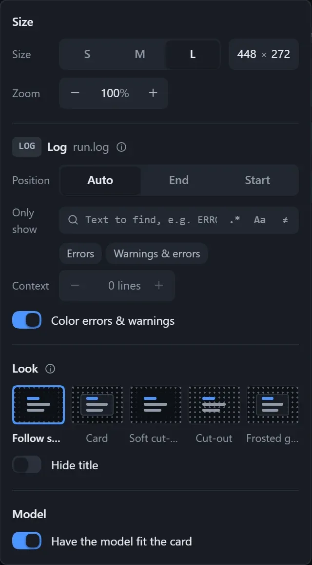
The popover is grouped into Size, content, Look and Model, and lists only the options that apply to the current content.
| Setting | Description |
|---|---|
| Size | S, M, L, or Custom width (160–1600) and height (100–1200). |
| Zoom | 25%–400%, default 100%. |
| Look | Follow settings or choose one for this card; see below. |
| Hide title | The title fades out when the card is neither selected nor hovered; good for images and sticker-like content. |
| Have the model fit the card | On by default; tells the step that writes the file how big the card is, so it looks good both in the card and when opened on its own. |
Default sizes (width × height):
| Content | S | M | L |
|---|---|---|---|
| Images, folders | 208 × 136 | 320 × 216 | 448 × 296 |
| Web pages | 208 × 128 | 320 × 176 | 448 × 256 |
| Markdown | 208 × 160 | 320 × 232 | 448 × 320 |
| Text | 208 × 128 | 320 × 192 | 448 × 272 |
Four looks
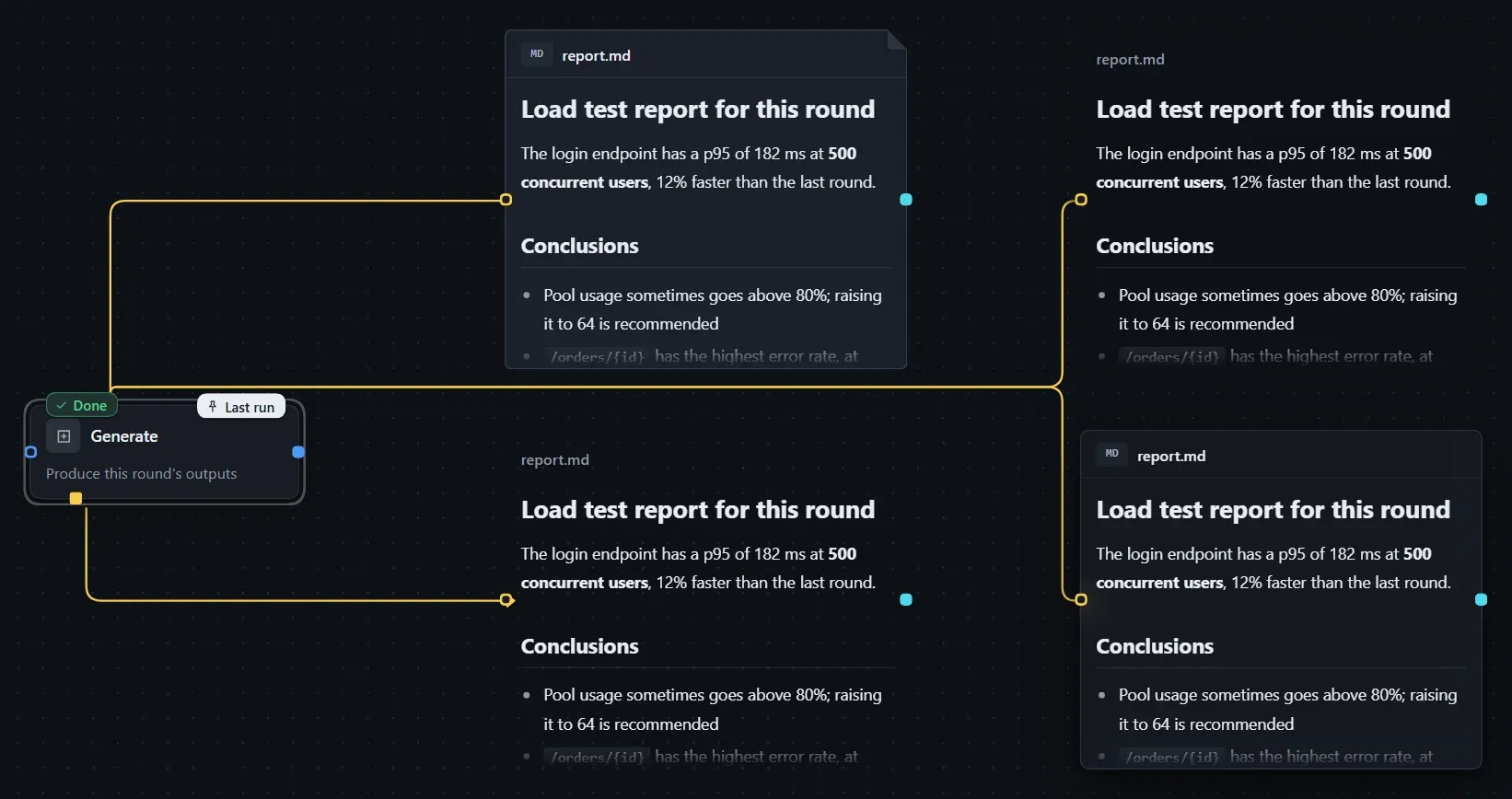
Section titled “Four looks”The same Markdown, from left to right and top to bottom: card, soft cut-out, cut-out and frosted glass.
| Look | Effect |
|---|---|
| Card | With a border and a title row. |
| Soft cut-out (default) | The content sits transparently on the canvas, and the canvas under it fades out. |
| Cut-out | Even the canvas dots show through. |
| Frosted glass | A translucent card face with the canvas blurred behind it. |
The default look is chosen in Workflow hub → Settings → Appearance; see Plugin settings and themes.
- Text in GBK, with a BOM, or in UTF-16 is supported, and terminal color codes are not shown literally.
- When exporting as a skill, Have the model fit the card is not carried over.